A behind-the-scenes look at how I rebuilt my personal site from scratch—and the 300+ commits it took to make every pixel, sound, and interaction feel intentional.
Building itsmeray v6
There’s a particular kind of madness reserved for developers who decide to rebuild their personal site from scratch. Not because the old one was broken, but because it no longer felt right. It no longer represented who they are, or more accurately, who they’ve become.
This is the story of how I built itsmeray v6—the 6th iteration of my portfolio site—from a blank astro init on a dull January evening to the 300+ commit, feature-rich digital representation of me it is today.
It’s not a tutorial or a technical deep dive. It’s a reflection on the journey, the decisions, the obsessions, and the things I’ve learnt along the way.
The Beginning: January 2, 2026
The whole thing first started by my inspiration of Zach Khong’s personal site, which I stumbled by accident via doomscrolling. There was something about the way it felt that made me think: I want that, but mine. It was truly a love at first sight (a weird thing to say towards a dude’s site but no homo).
Funnily enough, after I launched v6 and posted about it on LinkedIn, Zach himself reached out and asked if his site was the inspiration. It was, and I was glad he noticed.
In hindsight, it probably would’ve been more gentlemanly if I asked for his consent beforehand, but I’m thankful that he was easygoing about it.
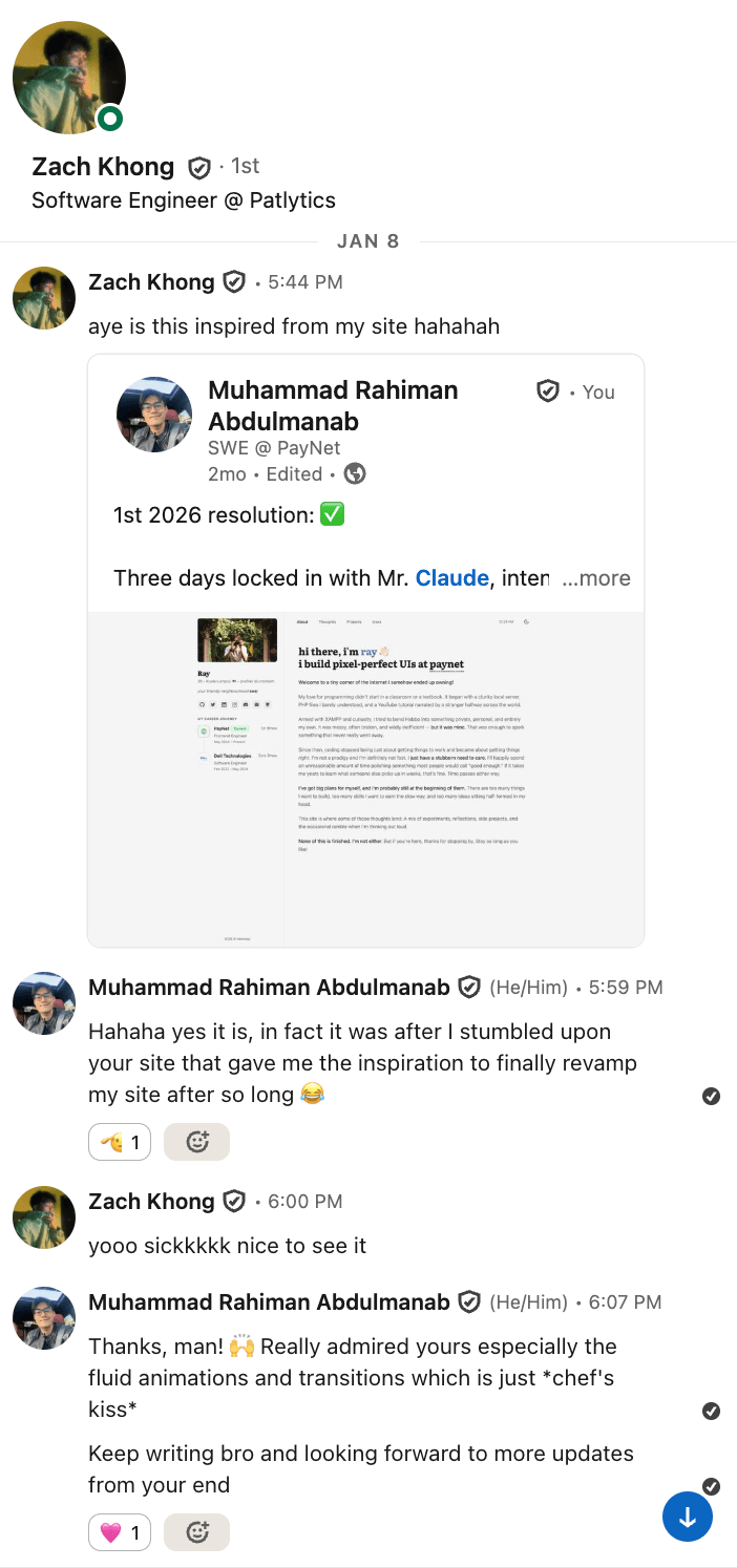
My conversation with Zach
Within the first 24 hours, I pushed over 20 commits. Setting up TypeScript, Netlify deployment, Tailwind CSS, dark mode (priorities much), accessibility improvements, prefetching strategies. The bones of the site were basically laid down in a single sitting.
Like most engineers with their side projects, I remember spending an embarrassing amount of time that first day just getting the dark mode color scheme right out of all other things. Switching from gray-800 to neutral-600 doesn’t sound like much, but when you’re staring at your own site for hours on end, even the slightest warmth in the background makes a difference.
The First Week
The pace was relentless. By the end of the first week, the site had:
- A blog system with Astro Content Collections, Markdown/MDX support, and proper frontmatter schemas
- Password-protected private posts—because some thoughts are meant for a smaller audience
- A reading time estimator so readers know what they’re getting into
- Copy-to-clipboard code blocks with syntax highlighting that respects the current theme
- An RSS feed for the three people who still use RSS readers (myself included)
- A Uses page detailing my equipment and tools (migrated from my previous site)
- PWA support—installable, offline-capable
- Table of Contents generation with smooth scrolling
- External link indicators—small arrows that tell you when a link takes you elsewhere
Looking back, that first week set the tone for everything that followed. I wasn’t just building a site; I was building a system. Every feature had to feel like it belonged, not bolted on.
Photography, Lightbox, and Learning to Let Go
On January 4th, I added the photography page which is a new feature dedicated to showcase some of the favourite shots taken by yours truly. What started as a simple image gallery quickly spiralled into one of the most technically involved features of the entire site.
The lightbox alone went through several iterations—modal overlays, keyboard navigation, touch swipe gestures for mobile, a thumbnail carousel at the bottom.
I remember wrestling with an annoying bug where swiping through thumbnails would accidentally trigger the main swipe navigation. The fix was subtle but satisfying: isolating touch event handling for the thumbnail strip.
Each photo carries metadata—the camera, the film stock, the location. It’s a small touch, but it matters to me as a photographer. Photography is as much about the process as the result, and I wanted the page to reflect that.
The Obsession with Microinteractions
As a self-proclaimed fastidious person, the little things always meant more to me than others. But this obsession towards animations and microinteractions began after discovering Emil Kowalski’s work. I even went insofar as to buy her animations.dev course.
It was around mid-January when things started to get interesting. I applied what I learnt by adding skeleton loaders for everything be it the profile image, blog post cards, the thoughts page itself. Then came the search bar, pagination, sorting (ascending and descending), and a font size slider with a glide animation.
But the real rabbit hole was none other than sound effects.
On January 18th, I wired up audio feedback across the entire site. Button taps, modal opens and closes, navigation transitions—each with a carefully chosen sound. I went back and forth on whether this was too much, whether it crossed the line from delightful to annoying.
It was when one of my colleagues pointed it out on how annoying it got after a while that I decided I needed to turn it off. The answer was to add a mute toggle later on with the sound effects toggled off by default, so users could choose for themselves.
Around the same time, I integrated haptic feedback for mobile devices. I’d be remiss not to thank my friend Kimi for introducing it to me!
It’s one of those things most visitors will never consciously notice, but subconsciously, it makes the site feel more alive. There’s a physicality to tapping a button and feeling a subtle vibration that no amount of CSS animation can replicate.
APIs Everywhere
The site isn’t just a static collection of pages. It’s a **living dashboard **of things I truly care about.
- Spotify Now Playing—a widget in the sidebar that shows what I’m currently listening to, complete with a marquee for long track names, a spinning vinyl disc animation, and a lil zzz animation when nothing’s playing
- Hardcover Books API—the Readings page pulls my reading list in real-time, showing book spines you can hover to reveal details, genres, and reading progress (+ it acts a form of motivation for me to keep reading)
- Discogs API—the Vinyls page displays my physical record collection in a scattered, draggable layout
- GitHub Calendar—contribution activity visualised right on the projects page
- Microlink API—bookmark previews with auto-generated thumbnails
Each integration taught me something about caching, error handling, and the art of making external data feel native to your site. The Spotify widget alone went through seven bug-fix iterations before it worked reliably across browsers, mobile, and Safari (which, as any web developer knows, deserves its own special circle in the debugging inferno).
Ray’s Design System
Around mid-February, I took a step back and established a proper design system token layer. The idea came from this tweet, which among other things encouraged frontend developers to build a real design system once instead of basic Tailwind colours out of the box, then reuse it everywhere.
CSS custom properties for colors, shadows, radii, and z-index scales. Everything references tokens—bg-card, bg-overlay, border, accent.
This wasn’t glamorous work. Unless I’m required to present my side project during a technical interview, no one will ever look at and scrutinise my CSS variables. But it was arguably the most important refactor of the entire project. It meant that when I later added the sunlit background theme—an animated gradient overlay that shifts the entire mood of the site—I could do so without rewriting a single component’s styles.
Speaking of the sunlit background, that by the way was its own saga. It looked beautiful on Chrome but completely broke on Safari. I count seven consecutive Safari bug-fix commits on February 18th alone.
Eventually, I made the pragmatic call to disable it on Safari and on mobile entirely, only to then just say fuck it and temporarily disabled it altogether because it’s hogging CPU memory like crazy to the point that my MacBook Pro’s fans started kicking in. Sometimes the best feature is knowing when to hold back.
Command Palette and Keyboard Shortcuts
On February 20th, I shipped the Command Palette—a Cmd+K interface that lets you search through every page and blog post, navigate with arrow keys, and jump anywhere instantly. I added keyboard shortcuts too: g + h for home, g + t for thoughts, and so on.
Later, I extended it with full-text search powered by Pagefind. It indexes all Thoughts and TIL content at build time into a static binary index, then loads on demand when you actually search—roughly 6KB upfront, with index chunks fetched as needed. The result: you can search inside posts, not just by title. Pagefind returns highlighted excerpts so you can see exactly where your query appears, and results show up in a dedicated “Content matches” section below the usual page and title matches. Private posts are excluded from the index entirely.
This was one of those features I built entirely for myself. The vast majority of visitors will never press Cmd+K. But for the ones who do—fellow developers, keyboard enthusiasts, power users—it’s a small signal that says: this site was built by someone who cares about the same things you do.
Sound effects were wired into the palette too. Every keystroke, every selection, every dismiss. It sounds excessive on paper, but in practice, it gives the interaction a tactile quality that flat UIs often lack.
The Personal Touches
Some features exist purely because they bring me joy and after getting inspired from a bunch of random tech tweets that popped up on my Twitter feed:
- Brain Dumps—click the profile photo in the sidebar and a modal pops up with draggable sticky notes of random thoughts
- Quotes—a rotating collection of quotes in the sidebar with a typing cursor animation
- Animated icons—over 30 SVG icons derived from itshover.com that respond to hover and interaction, built as React components with motion
- A handwriting signature on blog posts via Penflow
- Dynamic OG images—every blog post generates its own Open Graph preview image on the fly
- A last-updated tooltip on the sidebar copyright that pulls the date from git history
- Sidenotes—a custom Rehype plugin that renders footnotes as margin notes on wider screens
- PDF export for blog posts, with a dedicated print-friendly layout and dark mode toggle
- Reading mode—a distraction-free view for long-form content
Networks and FLIP Animations
The Networks page (originally called “Friends”) showcases talented people in my professional circle. It was inspired by Alexey Taktarov’s tweet where he showcased a section of his site dedicated to his friends.
Each card has a modal with their details, and on every page load, the cards shuffle with a FLIP animation—the kind of thing that takes five minutes to describe and five hours to implement correctly.
FLIP (First, Last, Invert, Play) animations are deceptively tricky. The basic idea is simple: record where elements are, move them, calculate the difference, animate the inversion. But factor in varying card sizes, staggered delays, and the need for it to feel natural rather than mechanical, and you’ve got yourself a proper engineering challenge.
The Mobile Revamp
Early March brought a complete overhaul of the mobile experience. The old bottom navigation was replaced with a floating bar and a full sidebar drawer that slides in with all the same features as the desktop sidebar—typing animation, social links, quotes, and Spotify widget.
The drawer persists across page navigations using Astro’s transition:persist, so opening the drawer, navigating to another page, and coming back doesn’t lose your state. It’s a small UX detail, but it’s the difference between a site that feels like a native app and one that feels like a website.
Today I Learnt and Beyond
One of the most recent additions is the TIL (Today I Learnt) section—inspired by Malcolm Kee’s own Today I Learnt page. It’s a lightweight content collection for quick technical notes that don’t warrant a full blog post. Tag filtering, search, code blocks with syntax highlighting. It’s the kind of section I wish more developer sites had—and now mine does too!
I also added a newsletter subscription prompt courtesy of Buttondown and a save for offline reading button—also inspired by Malcolm’s. The latter ties into the PWA service worker, caching posts locally so they’re available even without an internet connection.
The Complete Feature List
For those who enjoy a comprehensive inventory, here’s everything that made it into v6:
Pages & Sections
- Home—animated intro, gradient text, waving emoji, profile overview
- Thoughts—blog with pagination, search, sorting, tags, private posts
- Today I Learnt—quick learning notes with tag filtering and search
- Readings—interactive bookshelf powered by Hardcover API
- Projects—portfolio with GitHub contribution calendar
- Photography—masonry gallery of photos uploaded on Unsplash with lightbox, swipe navigation, EXIF metadata
- Bookmarks—curated web resources with auto-generated previews
- Vinyls—draggable vinyl collection via Discogs API
- Uses—tools, gear, and Code::Stats integration
- Networks—featured creators with shuffled FLIP animation cards
- Colophon—the tech stack, design decisions, and integrations behind the site
Core UI
- Persistent desktop sidebar with typing animation, work experience timeline, tools carousel, quotes, and Spotify widget
- Lofi music player with playback controls, seek bar, playlist toggle, and CSS vinyl disc—persists across page navigations
- Mobile floating bar with full sidebar drawer
- Command Palette (
Cmd+K) with keyboard shortcuts and full-text search via Pagefind - Dark/light mode with clip-path transition animation
- Breadcrumb navigation across all pages
- Back-to-top button
- Font size accessibility controls
Blog Features
- Reading time estimates
- Auto-generated Table of Contents with animated SVG path
- Syntax highlighting with theme-aware Shiki, filename labels, line highlighting, and diff notation
- Copy code button on all code blocks
- Sidenotes/footnotes system (custom Rehype plugin)
- Image lightbox for inline images
- PDF export with print-friendly layout
- Reading mode for distraction-free viewing
- Handwriting signature via Penflow
- External link indicators
- Password protection for private posts with loading spinners during verification
- View counts on Thoughts and TIL posts via Upstash Redis
Integrations
- Spotify—now playing widget with marquee, spinning vinyl disc, idle zzz animation
- Hardcover—books with spine view, genres, reading progress
- Discogs—scattered draggable vinyl records with details modal
- GitHub—contribution calendar
- Microlink—bookmark preview thumbnails
- Pages CMS—content management for data files
- YouTube IFrame API—lofi music player with 25-track Lofi Girl • The Sims album, CSS vinyl disc, and playlist view
- Cloudflare Web Analytics—privacy-friendly, cookie-free analytics
Design & Polish
- Design system token layer (CSS custom properties for everything)
- 30+ animated SVG React icon components (derived from itshover.com)
- Skeleton loaders across all pages with LQIP blur placeholders for photography
- Sound effects on interactions (with mute toggle)
- Haptic feedback on mobile
- FLIP animations on Networks page
- Staggered entrance animations
- Smooth page transitions via Astro View Transitions
- Brain dumps modal with draggable sticky notes
- Dynamic OG image generation
- Structured data (JSON-LD) for SEO
- RSS feed
- PWA with offline support
- Newsletter subscription
- Save for offline reading
- Last-updated tooltip from git history
The Numbers
Since that first commit on January 2nd:
- 300+ commits across 11 weeks
- 11 main sections of the site
- 7 external API integrations
- 4 content collections
- 30+ animated SVG icons
- 1 command palette and countless keyboard shortcuts
- An unknowable number of hours spent debugging Safari
What I’ve Learnt
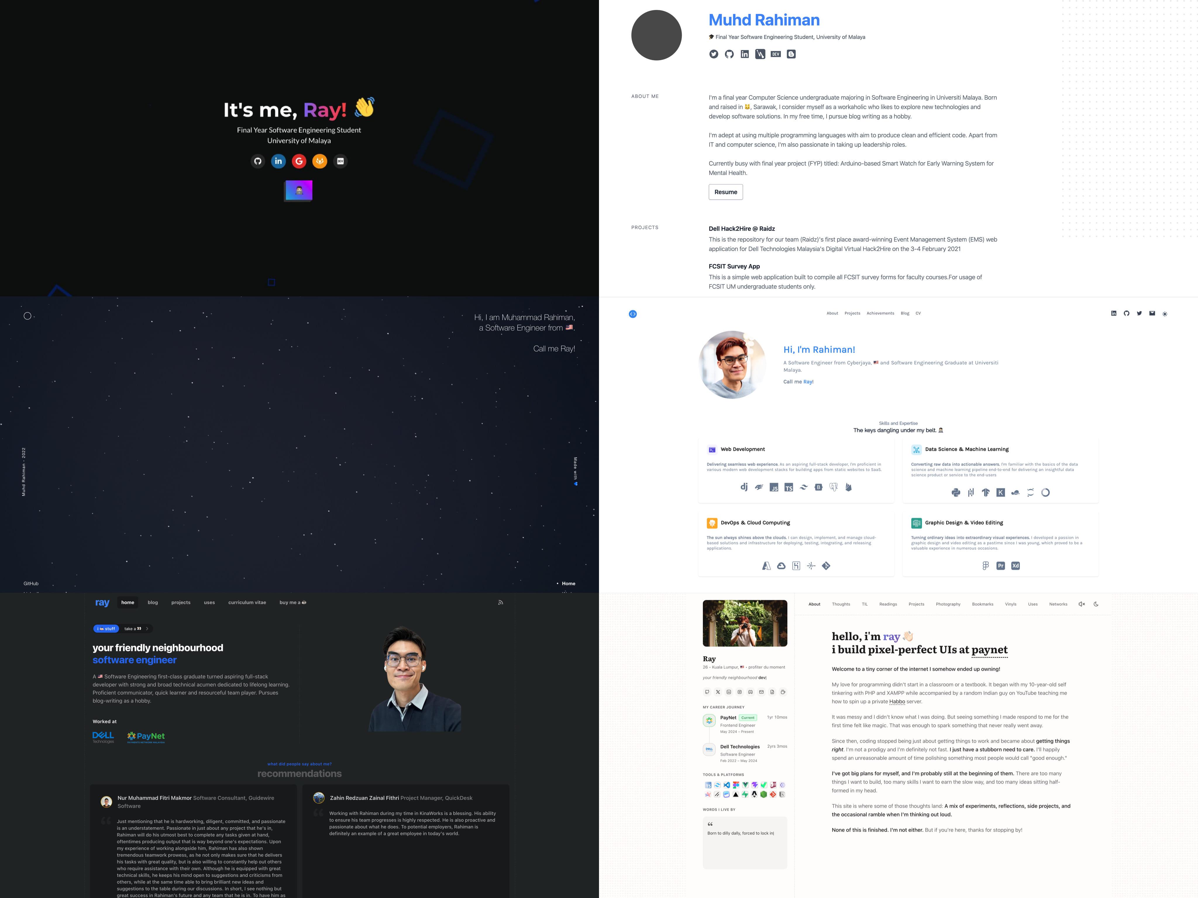
From left to right, v1 to v6 spanning 6 years.
I’ve come a long way since my very first portfolio website back in Feb 2021. It has undergone so many iterations, and in many ways signifies the sheer growth that I went through over the years.
Building this site taught me more than any course or tutorial ever could.
I learnt that Safari is not a browser—it’s a character-building exercise. I learnt that the difference between a good site and a great one is the 80% of work that goes into the last 20% of polish. I learnt that sound design on the web is an underexplored frontier, and that haptic feedback is the unsung hero of mobile UX.
I also learnt that there’s no such thing as “done” when it comes to a personal site. Every time I thought I was finished, I’d notice something—a transition that felt too abrupt, a skeleton loader that flickered on fast connections, a tooltip that didn’t appear on Safari. The backlog is infinite, and that’s okay.
Most importantly, I learnt that a personal site should be personal. Not a template with your name swapped in. Not a clone of whatever’s trending on Dribbble. But a genuine reflection of how you think, what you value, and the craft you bring to your work.
Every pixel, every animation, every subtle sound—it’s all intentional. And if that sounds obsessive, well, I think that’s kind of the point.
In the process, I shamelessly reloaded my Claude Pro credits a few times just to keep the momentum going. When you’re deep in the zone at 2AM and your usage limit hits, the rational thing to do is call it a night and wait for the reset. The irrational thing to do is top up your credits and keep shipping.
At first, I questioned whether this site was truly mine, since Claude did much of the heavy lifting. It felt a little like the Ship of Theseus: if enough of the parts are replaced, at what point does something stop being yours?
But I’ve since come to see Claude for what it is: a tool. The vision, direction, and final decisions still came from me, and that is reason enough to call this work my own.
I also learnt that nothing we make is ever created in a vacuum. Every conceived idea is shaped in some way by the things we have seen, admired, borrowed from, or been moved by. The people around us, the work we love, the conversations we remember, the sites we wish we had built first—all of it leaves a mark.
We are all, in some way, a mosaic of the people we have met, the work that has moved us, and the ideas we carry forward. So maybe the goal was never to create something out of thin air, but to take all those fragments and make them feel unmistakably like you.
This site is—and will always be—a work in progress, just like its creator. There are features I haven’t shipped yet, ideas sitting in the back of my mind, and probably a few Safari bugs I haven’t discovered. But for now, it feels like me—and that’s all I ever wanted it to be.